Date Field Validations
Date range restrictions
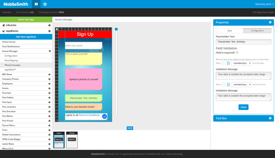
For any date field on an Input canvas, you can set the range of allowable dates. Once you position the date field on the canvas, select it, and then select the Configuration tab on the Properties box on the right.
Like other field types, you can specify the Placeholder Text - this is what the field displays before the app user selects a date - and you can make the field required - this means the app user will not be able to submit/save if the field is empty.
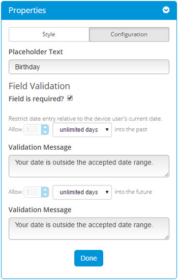
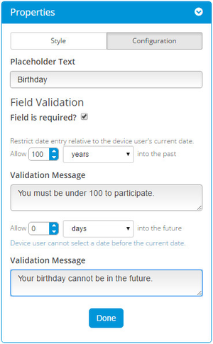
You can set both the future and the past range, which are both set to "unlimited days" by default. Thus, if you do not modify the default range settings, the app user will be able to select any date. If you want to limit the allowable date range, you must first change the units dropdown to something besides "unlimited days" - the other options are "days", "weeks", and "years". When you select one of the other options, the number field becomes editable, and you can specify the exact number (of days, weeks, or years).
Past Range
You can set the past range - this limits how far back in time the field will allow.
You can enter a validation message to show if the app user exceeds the past range.
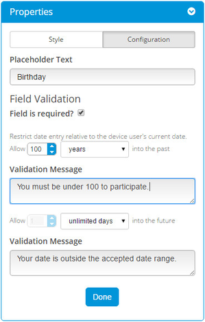

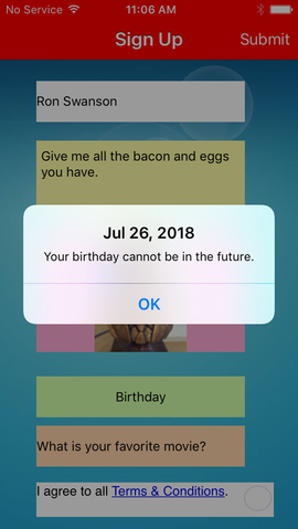
Future Range
You can set the future range - this limits how far into the future the field will allow.
You can enter a validation message to show if the app user exceeds the future range.
Availability
Date validations are available on any Input canvas in the following AppBlocks: