The Input View displays user input fields such as text boxes, text areas, dropdown menus, and date selectors.
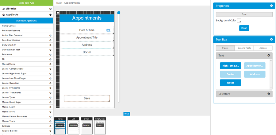
Input View canvas
Canvas Dimensions
- Fixed Width – 640 pixels (High-Res) / 320 pixels (Low-Res)
- Maximum Height – No Limit
Navigation Bar
- Submit button will display if AppBlock is ‘Form Submission to Email’ OR ‘Registration’.
- The title in the navigation bar is the name of the AppBlock (can be modified on the Configuration page for the AppBlock).
Right Click Options
- Customize Scroll View
- Copy/Paste Scroll View Layout
- Copy/Paste Layout – copy & paste the layout of fields on the canvas
- Bring to Front – use for layering of fields on canvas
- Send to Back – use for layering of fields on canvas
- Low-Res Dimensions
- High-Res Dimensions
- Delete – will remove chosen field from canvas (can be added again)
Valid Input Field Types
- Text Box
- Text Area
- Dropdown
- Date
- Check Box
- Photo
- Time
AppBlocks that have an Input View
- Form Submission to Email
- Flex (if needed based on configuration)
- Registration
- Component REST
Related articles
| Filter by label (Content by label) | ||||||||||||||||||
|---|---|---|---|---|---|---|---|---|---|---|---|---|---|---|---|---|---|---|
|
| Page Properties | ||
|---|---|---|
| ||
|