The purpose of a Detail View is to display data for a single item, such as an employee.
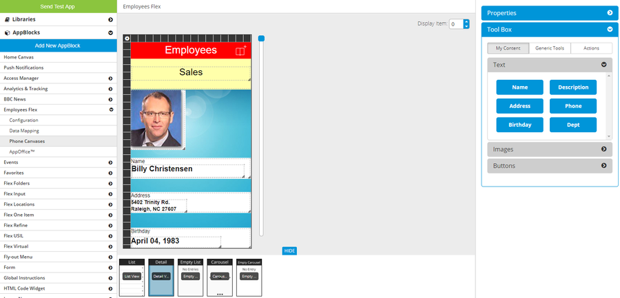
Detail View canvas
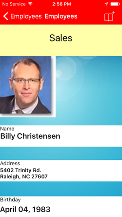
Detail View on iPhone
For a Flex One Item AppBlock, the only available canvas is Detail View. Since there is only one item in this AppBlock, the data shown will always be from this one item.
You can set the page's Background Color.
You can adjust the height of the page by dragging and dropping the lower border of the canvas. On a phone, the user will be able to scroll up and down.
You can add a header and/or footer. These areas stay fixed when the app user scrolls up and down on the page.
**NOTE** - currently unavailable in the Component REST AppBlock.
You can see data from different items by changing the Display Item number.
This video shows hows to adjust the page height, add and customize a header (a footer works exactly the same except it displays at the bottom of the page), and see data from different items:
| Widget Connector | ||||||
|---|---|---|---|---|---|---|
|
In the Tool Box, under the Actions tab, are the action buttons. Some are only available under certain conditions:
- Add To Calendar - only available if you have a field marked as "Start Date" in Data Mapping.
- When tapped, this button lets the app user add an event to his device's calendar.
- Bookmark Item - always available
- When tapped, this item will now appear in the Bookmarks AppBlock.
- When tapped, this button will change to the "Un-bookmark" action button.
- Share Item - always available
- When tapped, this button lets the app user share the current item.
- More Options - always available
- When tapped, this button opens up the More menu, which can contain other action buttons.
- Edit Item - only available if you answered "Yes" to the Configuration question "For this AppBlock, can an app user edit or update content?"
- When tapped, this button goes to the AppBlock's Input page.
- Delete Item - only available if you answered "Yes" to the Configuration question "For this AppBlock, can an app user delete content items?"
- When tapped, this button asks the app user if he is sure and then deletes the current item. The app returns to the List page.
Related articles
| Filter by label (Content by label) | ||||||||||||||||||
|---|---|---|---|---|---|---|---|---|---|---|---|---|---|---|---|---|---|---|
|
| Page Properties | ||
|---|---|---|
| ||
|