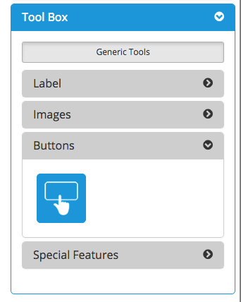
Buttons
There is one button located in the Tool Box. Buttons allow you to assign a target AppBlock to the App Canvas - this is where the app will go when the app user taps this button.
When you drag and drop the button onto the canvas, you can choose to use one of the button options below:
Plain Button
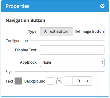
A Plain Button has its own Background Color and , its own Text Color, as well as a Corner Radius.and the option to adjust the corner radius for iOS devices. A Plain Button can also be referred to as a "Text Button" because you use text to identify it.
Button w/ Image
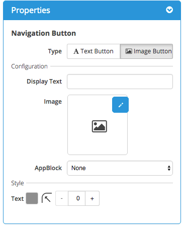
A Button w/ Image allows you to use a designed image instead of text as a button. It is best practice to include any desired text as part of your designed image.
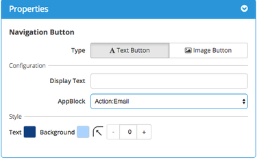
Style - Plain Button
For a Plain Button, you can configure it in the Properties box on the right side of the App Canvas. Choose the Text Button option then complete the configuration.
You can set Display Text and choose your Background Color and Text Color. Layering should be avoided as it will interfere with the animation features present for Android devices.
You can set the Corner Radius - if this is high, the button will have rounded corners. If the Corner Radius is 0, the button will have square corners. The option to adjust the corner radius is available for iOS devices. Android has a corner radius of 2 dp by default for text buttons. If you adjust the corner radius in the platform, you will only see the change on iOS devices.
Remember to assign the correct AppBlock to the button.
Style - Button w/ Image
For a Button w/ Image, you can configure it in the Properties box on the right side of the App Canvas. Choose the Image Button option then click the Edit icon to select an image from your Image Library (or upload a new image).
Recommended best practice to avoid using the Display Text when choosing an Image Button - include text as part of your image design. Layering is discouraged as it will interfere with the animations present for Android devices.
You can set the Corner Radius - if this is high, the image will have rounded corners. If the Corner Radius is 0, the image will have square corners.Corner radius is not available for buttons with an image.
Remember to assign the correct AppBlock to the button.
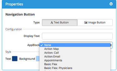
Assigning an AppBlock to a Button
To assign an AppBlock to a Button:
Click on the arrows next to the AppBlock field - a dropdown list of available AppBlocks will appear.
Click on the AppBlock you want to assign to the Button.
The chosen AppBlock will then be seen under the Properties for that Button.
Complete the configuration steps for your Button type of choice.
Related articles
| Table of Contents |
|---|
| Page Properties | ||
|---|---|---|
| ||
|