Home Canvas
The configuration of the Home Canvas is unique among canvases in the MobileSmith Platform. The reason for this is the fact that the Home Canvas does not and will not scroll up and down. It is designed to fill the entire screen of the device it's being displayed on - whether that be an iPhone 4s, iPhone 5, iPhone 6 Plus, or an Android device. In addition, all images and text placed on the Home Canvas will be installed with the app on the device upon download. This provides the ability to use larger, high-resolution images without having to worry about loading time when a user opens the app (an advantage of a native app vs. a web app).
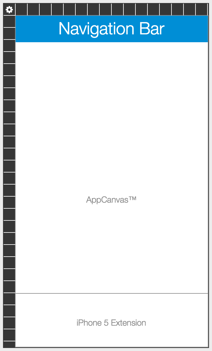
The user interface of the app is important to MobileSmith and will be important for your end users, so we've built design logic into the Home Canvas so that all devices end up with a professional looking home page. We use device aspect ratios and not pixel dimensions to translate your design in the Platform onto iPhone and Android mobile devices. You'll notice a gray divider line on the Home Canvas that cannot be removed; this serves as your way to support small screen sizes for Android and the iPhone 4s (we only support iOS 8, 9 and 10, therefore, we don't support the iPhone 4) as well as the newer, larger screen sizes for Android devices and the iPhone 5, iPhone 6, and iPhone 6 Plus.
The screen shots below show an example Home Canvas (see Global Navigation for other Home Canvas options) and the process of creating a new divider line that creates two separate areas.
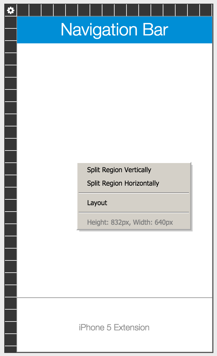
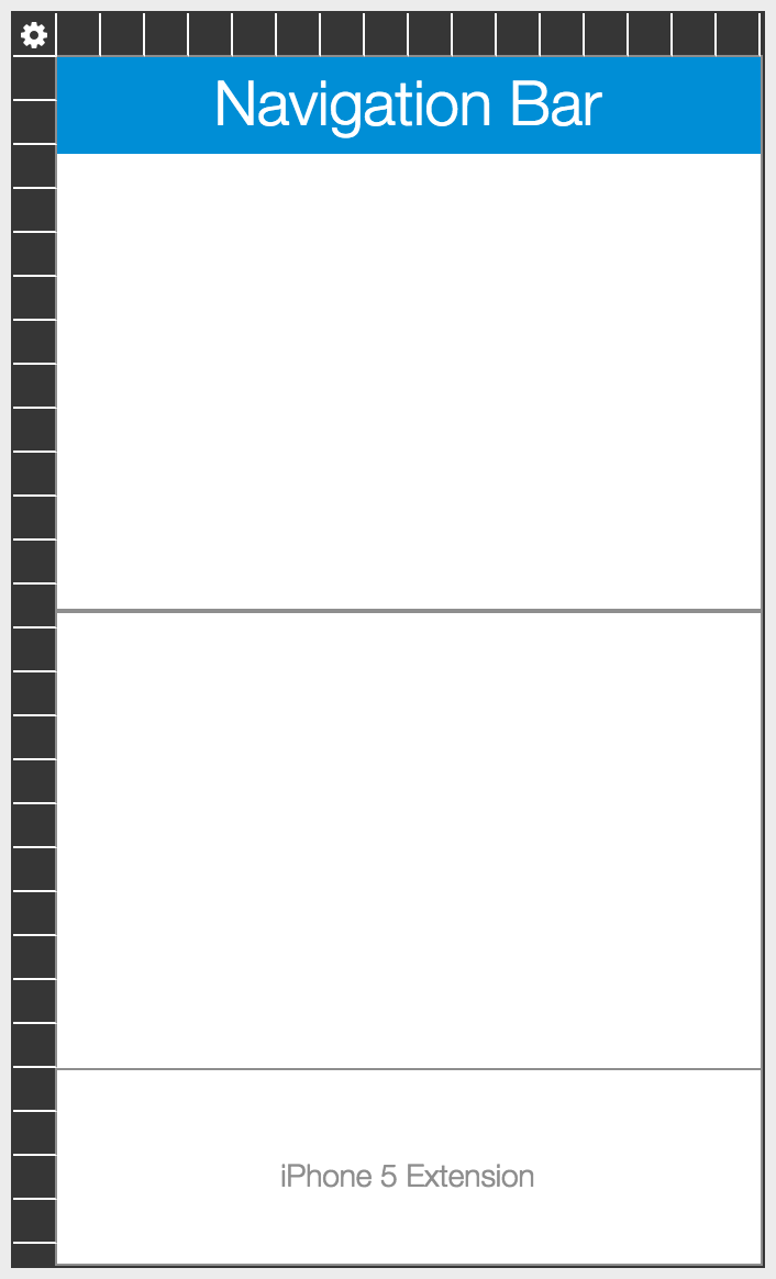
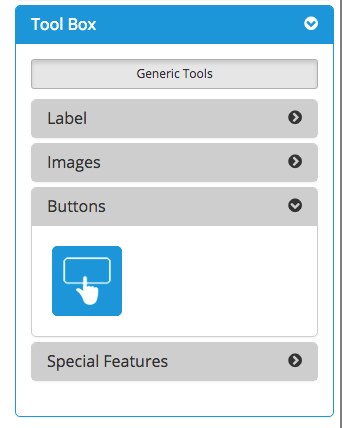
Once you have created an area with the desired dimensions (you can see the height and width in pixels of any area by right-clicking), you can add elements from the Tool Box on the right side. Find the element you want to add and then drag-and-drop it onto the appropriate area of the Home canvas.
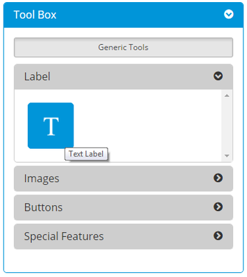
Label
Text Label
A Text Label is the simplest way to add text to the Home canvas for buttons or a call-out.
A Text Label has no background color (100% transparent) and uses the Global Text Color as its text color.
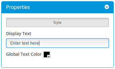
Properties
Once you have dropped a Text Label onto the Home canvas, click it and you can configure it in the Properties box on the right side. You can enter the desired text and set the Global Text Color.
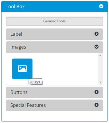
Images
Image
An Image is a way to add graphics to your Home page.
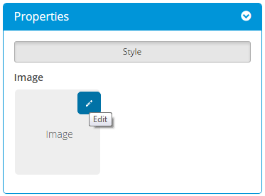
Properties
Once you have dropped an Image onto the Home canvas, click it and you can configure it in the Properties box on the right side. Click the Edit icon to select an image from your Image Library (or upload a new image).
Buttons
There is one button located in the Tool Box. When you drag and drop the button onto the canvas, you can choose to use one of the button options below:
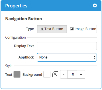
Plain Button
Similar to a Text Label, except that you can also select the target AppBlock - this is where the app will go when the app user taps this button.
A Plain Button has its own Background Color and its own Text Color, as well as a Corner Radius.
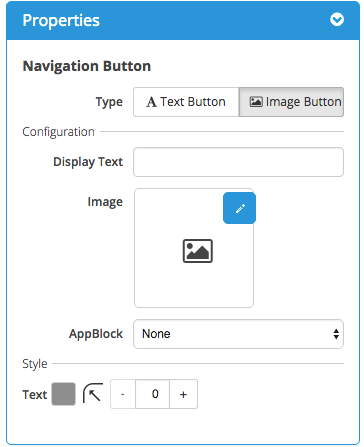
Button w/ Image
Similar to an Image, except that you can also select the target AppBlock - this is where the app will go when the app user taps this button.
A Button w/ Image allows you to use a designed image instead of text as a button. It is best practice to use text as part of the image instead of the Display Text, with the option of a Corner Radius.
Navigation
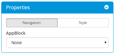
For both types of button, you can set the button's target, i.e. where the app should take the user when he/she taps the button. Once you have dropped the button onto the Home canvas, click it and then go to the Navigation tab in the Properties box on the right side. There will be a dropdown menu with all of your AppBlocks. Each button's target is set to "None" by default (if you leave a button set to "None", it just means that nothing will happen when the app user taps it).
Style - Button w/ Image
For a Button w/ Image, you can configure it in the Properties box on the right side. Click the Edit icon to select an image from your Image Library (or upload a new image).
Recommended best practice to avoid using the Display Text when choosing an Image Button - include text as part of your image design. Layering is discouraged as it will interfere with the animations present for Android devices.
You can set the Corner Radius - if this is high, the image will have rounded corners. If the Corner Radius is 0, the image will have square corners.
Style - Plain Button
For a Plain Button, you can configure it in the Properties box on the right side.
You can set Display Text and choose your Background Color and Text Color. Layering is discouraged as it will interfere with the animations present for Android devices.
You can set the Corner Radius - if this is high, the button will have rounded corners. If the Corner Radius is 0, the button will have square corners.
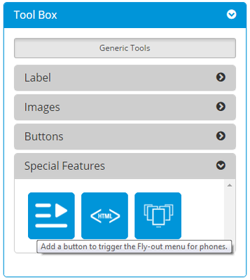
Special Features
Fly-out Button
Use this tool to give the app user another way to open the Fly-out Menu.
Use this tool to display a Code Widget AppBlock within a page.
Use this tool to create a dynamically changing section on the Home page of your app. This is very similar to a banner ad slider on a website.