Photo Gallery
Overview
The Photo Gallery AppBlock lets your app users view and share photos.
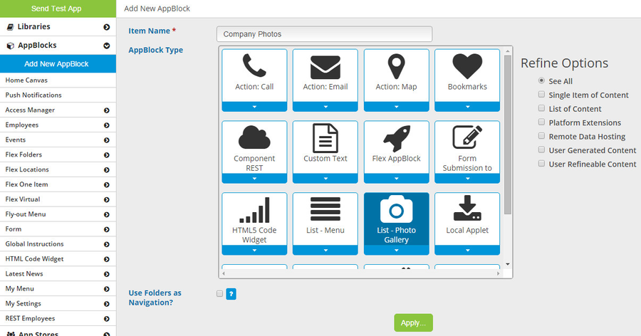
To create a Photo Gallery AppBlock, click the blue "Add New AppBlock" button. On the Add New AppBlock screen, select "List - Photo Gallery" and then click the green "Apply" button.
Configuration

On the Configuration page, you can change the Item Name (what you will see in the platform as you design your app) and the Display Name (what the app user will see while using the app).
You can copy the Deep Link to use with Gimbal.
You can set the List Sort Order - by default, the photos in the list will be sorted by the last updated date. This means the newest photos will be shown first. If you have not gone to Data Mapping for this AppBlock, the only field available to use for sorting will be "Date/Time". If you add additional fields in Data Mapping, you can then come back to Configuration and sort by any of those fields which are Short Text, Date, or Date&Time.
By default, any photo added by an app user will be "active" - this means it is shown to all app users. If you, as the app designer, would like more control over which images are shown publicly, you can check the "Require Image Approval?" checkbox. If this is checked, then any photo added by an app user will be "inactive" - this means it is not shown in the app. You can go to AppOffice to change any photo's status to active or inactive.
By default, any app user will be able to upload photos to the gallery. If you want to remove this ability, check the "Disable Upload?" checkbox.
You can add AppBlock instructions by checking the "Include Instructions?" checkbox.
Anytime you make changes on the Configuration page, be sure to click the green "Apply" button to save your changes.
Data Mapping
By default, your Photo Gallery AppBlock will have 4 fields: Photo, Comments, Location, and Date/Time. These default fields cannot be deleted, and you cannot add more. The main feature of Data Mapping in a Photo Gallery AppBlock is to allow you to set you social sharing fields. This affects what data gets sent when an app user shares an item (photo) to Facebook, Twitter, etc.

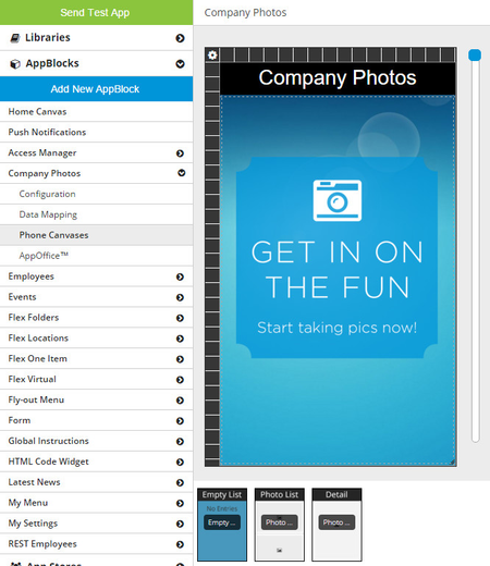
Canvases
Every Photo Gallery AppBlock has these 3 canvases: Empty List View, Photo List View, and Detail View.
Empty List View
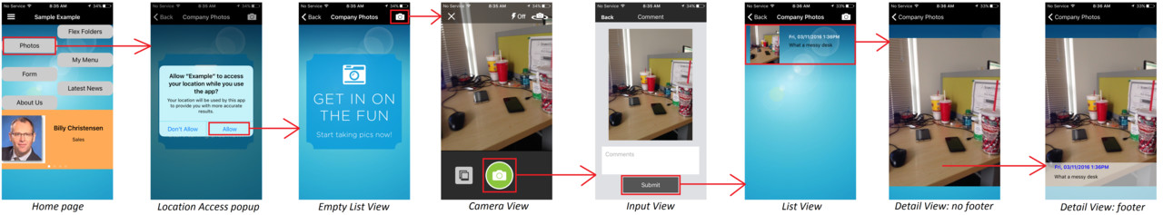
This page behaves just like any other Empty List View canvas. It is shown only when there are no active items. The first time you go to this AppBlock on your phone, there will be no items, so you will see the Empty List View. A common use for this page is to encourage the app user to add a new photo (see screenshot >>).
There are no content fields. You can use the generic tools Text Label and Image by opening the Tool Box on the right side and dragging them onto the canvas.
There are no action buttons - the app will include them automatically. When the app user is on the Empty List View, there will be an "Add" action button shown in the navbar.
Photo List View
This page behaves similar to other List View canvases. The biggest difference is that for a Photo List View, the row height is unlimited. This allows you to display the photos at a larger size.
There are 4 content fields you can add to the canvas: Comments, Location, Date/Time, and Photo. In the Tool Box on the right side, these fields are under the My Content tab.
Under the Generic Tools tab, you will find the generic tools Text Label and Image, which can also be used on this canvas.
There are no action buttons - the app will include them automatically. When the app user is on the Photo List View, there will be an "Add" action button shown in the navbar.

Detail View
This page behaves somewhat like other Detail View canvases, but there are some differences. The content field Photo is on the canvas by default and cannot be deleted.
The page also has a footer by default, and you cannot add a header. This footer is where you can place the other 3 content fields (Comments, Location, Date/Time) as well as generic tools (Text Label, Image).
There are no action buttons.

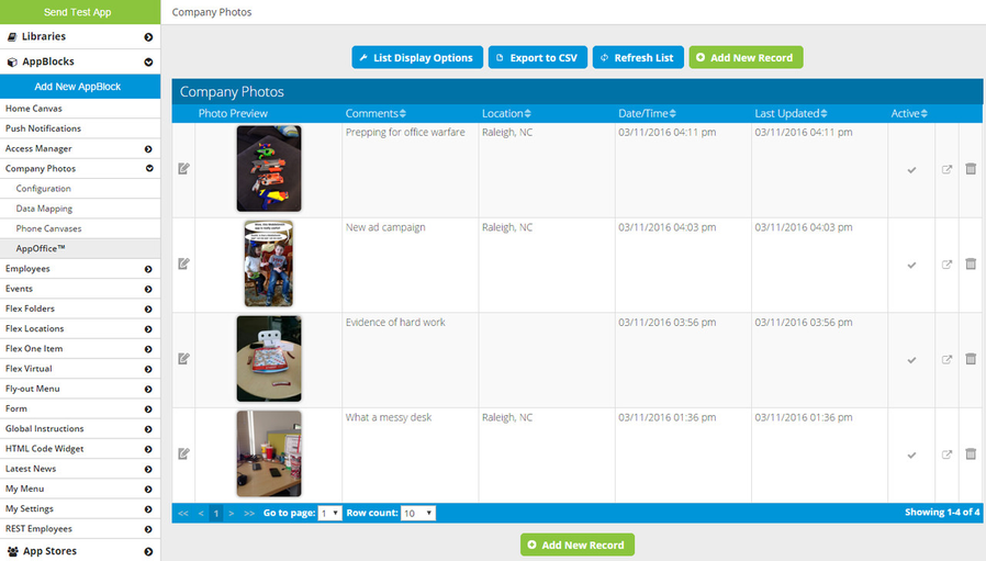
AppOffice
In AppOffice, you can see a table with all the photos that have been submitted. The table has a row for each photo with the following columns:
- Edit - click the pencil icon to edit the item
- Photo Preview
- Comments
- Location
- Date/Time
- Last Updated
- Active Status - click the plus icon (active) or the minus icon (inactive) to change the Active Status
- Deep Link - click the arrow icon to copy this item's Deep Link
- Delete - click the trashcan icon to edit the item
You can also add a new photo yourself by clicking the green "Add New Record" button. When you do this, you can enter the Location manually because the MobileSmith platform cannot detect your location. You can also leave it blank, as the Location is not required.
You can export the list to a CSV with the blue "Export to CSV" button. **NOTE** the CSV will contain a URL for each image, not the actual image.
Targeting
Once you finish designing your Photo Gallery, be sure to give the app user a way to get to it. Set the AppBlock as the target for a button, tab, Menu List row, or Fly-out Menu row.
Device Behavior
When the device user navigates to a Photo Gallery AppBlock, if there are no active items, it will show the Empty List page.
On the Empty List page, there is a camera icon in the upper right corner. Tapping this takes the user to the Camera View page.
iPhone: Empty List page
If the app user has not yet allowed the app to use his location, the app will ask permission to use the user's location.
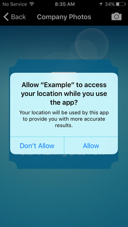
iPhone: Location access popup
When the device user navigates to a Photo Gallery AppBlock, it will show the Photo List page first if there is at least one active item.
On the Photo List page, the app user can scroll up and down. When the app user taps a row, it will go to the Detail page for that row.
There is a camera icon in the upper right corner. Tapping this takes the user to the Camera View page.
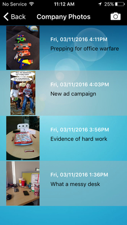
iPhone: Photo List page
On the Detail page, the app user sees the photo.
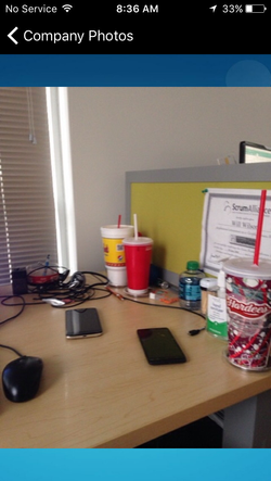
iPhone: Detail page - footer hidden
Tapping the photo will display the footer. Tapping again will hide the footer.
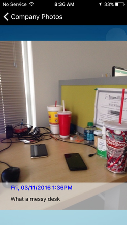
iPhone: Detail page - footer shown
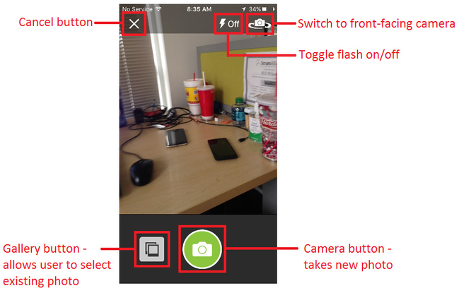
On the Camera View screen, the app user has a number of options:
- Cancel button - return to the previous page
- Flash toggle - turn camera flash on/off (not shown if camera has no flash)
- Camera toggle - switch to front-facing camera (not shown if device has no such camera)
- Gallery button - choose existing photo from device's gallery
- Camera button - take new photo
Here is an example of the sequence of screens an app user may see. In this example:
- The button targeting the Photo Gallery is on the Home page.
- The app user has not yet allowed the app to use his location.
- There are no active items currently in the Photo Gallery.